
Walk into any successful Amazon brand’s product listing, scroll past the title and bullets, and you’ll notice something: their A+ Content looks completely different from the average seller’s attempt.
It’s not just prettier it converts better. Sometimes 2x, 3x, even 5x better than listings without quality A+ Content.
I’ve analyzed hundreds of 7-figure Amazon brands, and they all use the same core design principles that most sellers completely miss. These aren’t expensive design tricks that require a professional agency. They’re strategic decisions about layout, messaging, and psychology.
Let me show you the exact 12 A+ Content design secrets that separate million-dollar brands from struggling sellers.
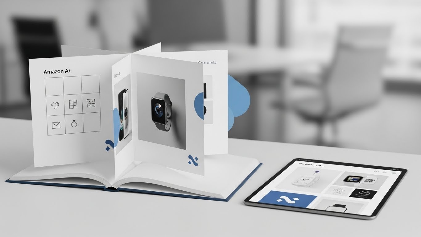
What Is Amazon A+ Content and Why It Matters

Before we dive into the secrets, let’s make sure we’re on the same page about what A+ Content actually is.
Amazon A+ Content (formerly Enhanced Brand Content or EBC) lets brand-registered sellers add rich media content below their product descriptions. Instead of plain text, you get:
- High-quality lifestyle images
- Comparison charts
- Brand storytelling sections
- Product feature highlights
- Video (in Premium A+ Content)
The impact? Amazon’s own data shows A+ Content increases sales by an average of 3-10%, with some products seeing 20%+ improvements.
Here’s why it works: most shoppers don’t read bullet points carefully. They scroll, scan images, and look for visual proof that your product solves their problem. A+ Content gives you that visual selling space.
Now let’s get into the secrets that make it actually work.
Secret #1: Start with the “Scroll Stopper” Module
The first module of your A+ Content is the most important. It’s where most shoppers decide whether to keep reading or bounce to a competitor.
What 7-Figure Brands Do:
They use the first module as a “pattern interrupt,” something visually striking that stops the scroll. This could be:
- A bold headline with a single powerful benefit
- A lifestyle image showing the product’s transformation
- A problem/solution visual that immediately resonates
- A comparison showing before/after results
What Average Sellers Do:
They start with a boring “About Our Brand” section that nobody reads. Or they use generic product images that look like everything else.
Your Action Step:
Lead with your strongest selling point. If you sell resistance bands, don’t start with “Welcome to our brand.” Start with “Build Muscle 3x Faster With Zero Joint Pain” alongside an image of someone using your bands successfully.
Make the first three seconds count. If they keep scrolling, you’ve won.
Secret #2: Use the “Inverted Pyramid” Content Strategy
Professional copywriters use the inverted pyramid method: most important information first, supporting details second, background info last.
The Structure That Converts:
Module 1: Main benefit/transformation (what they get)
Module 2-3: How it works/key features (why it works)
Module 4-5: Social proof/comparisons (why trust you)
Module 6-7: Secondary benefits/use cases (why buy now)
Why This Works:
Most shoppers only view the first 2-3 modules. If you bury your best-selling points in module 5, they’ll never see them. Front-load value.
Common Mistake:
Putting your brand story first and product benefits last. Flip it. Benefits first, brand story later, for people who want to know more.
Secret #3: Master the “Rule of Thirds” in Image Layout
7-figure brands understand visual hierarchy. They use the photographic “rule of thirds” to guide the eye naturally through their A+ Content.
How It Works:
Imagine dividing any image into a 3×3 grid. Place your most important elements at the intersection points, not dead center. This creates visual tension that draws attention.
Practical Application:
- Product images: Place the product in the left or right third, not centered
- Text overlays: Position headlines in the top third, not the middle
- Call-to-action elements: Place in the bottom right third (natural reading pattern)
Why It Matters:
Centered, symmetrical layouts feel static and boring. Off-center, dynamic layouts feel premium and hold attention longer.
Look at any Apple product page; they master this. Amazon’s top brands do too.
Secret #4: Create “Scannable” Content Blocks
People don’t read A+ Content; they scan it. Design for scanners, not readers.
Elements That Make Content Scannable:
Bold Headlines: Every module should have a clear, benefit-driven headline.
Short Text Blocks: 2-3 lines maximum per section.
Icon + Text Combos: Icons draw the eye, text explains.
Whitespace: Don’t cram everything together; let content breathe.
Numbered Lists: “3 Ways to Use” or “5 Key Benefits” are easy to digest
The 3-Second Test:
Can someone glance at your A+ Content for 3 seconds and understand your main value proposition? If not, simplify.
Real Example:
Bad: A paragraph explaining how your yoga mat has “superior grip technology using advanced TPE materials with moisture-wicking properties.”
Good: An icon of a hand + bold text “Non-Slip Grip” + one line “Stay stable in any pose, even during hot yoga.”
Scan-friendly always wins.
Secret #5: Use Lifestyle Images, Not Just Product Shots
This is the #1 difference between amateur and professional A+ Content.
Product Shots Show What It Is
Lifestyle Images Show What It Does
Your main product images already show what the item looks like. Your A+ Content should show the lifestyle, transformation, or emotion it provides.
Examples by Category:
Kitchen Products: Show a family enjoying a meal together, not just the spatula.
Fitness Products: Show someone achieving their workout goal, not just the equipment.
Pet Products: Show a happy, healthy pet and owner bonding, not just the toy.
Beauty Products: Show confidence and transformation, not just the bottle
The Emotional Connection:
People buy based on emotion and justify with logic. Lifestyle images trigger the emotional buy decision.
Budget-Friendly Tip:
You don’t need expensive photoshoots. Stock photography sites (Unsplash, Pexels) have high-quality lifestyle images you can use legally. Just ensure they match your product’s use case authentically.
Secret #6: Implement the “Problem-Agitate-Solution” Framework
This copywriting framework is gold for A+ Content. It’s how 7-figure brands structure their messaging.
How It Works:
Problem: Identify the specific pain point your customer has.
Agitate: Make them feel that pain (without being negative).
Solution: Present your product as the answer
A+ Content Example for Resistance Bands:
Module 1 (Problem): “Tired of expensive gym memberships you never use?”
Module 2 (Agitate): “Home workouts feel ineffective without proper equipment…”
Module 3 (Solution): “Get a complete gym workout at home with our resistance band system”
Why This Works:
It mirrors the customer’s actual thought process. They’re not looking for resistance bands; they’re looking to solve the problem of expensive, inconvenient fitness options.
Speak to the problem first, product second.
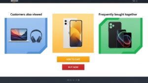
Secret #7: Add Comparison Charts (But Do It Right)
Comparison modules are powerful when done correctly. Most sellers screw them up.
What Top Brands Do:
They compare their product to the generic alternative or old solution, NOT to competitors by name.
Comparison Table Structure:
| Feature | Our Product | Generic Alternative |
| Durability | ✓ Lifetime warranty | ✗ 30 days |
| Included | ✓ 5 resistance levels | ✗ One band only |
| Price | $$ One-time | $$$ Monthly gym fee |
What NOT to Do:
Don’t name competitors. Amazon may reject it, and it looks desperate. Compare to “typical” or “standard” options instead.
The Psychological Trigger:
Comparison charts trigger loss aversion. Customers think, “If I buy the cheaper option, I’m losing these benefits.” This fear of missing out (FOMO) drives conversions.
Secret #8: Use the “Feature-Advantage-Benefit” Method
Amateur sellers’ list features. Professional brands convert features into benefits.
The Formula:
Feature: What it is (technical specification) Advantage: What it does (functional improvement) Benefit: What it means for the customer (emotional outcome)
Example for a Water Bottle:
Feature: “Double-wall vacuum insulation.”
Advantage: “Keeps drinks cold for 24 hours.”
Benefit: “Enjoy ice-cold water during your entire workout.”
In A+ Content:
Don’t just say “Made with BPA-free plastic.” Say “BPA-free materials protect your family’s health with every sip.”
Always bridge from feature → to the actual benefit they care about.
Secret #9: Incorporate Social Proof Strategically
7-figure brands know that trust converts. They weave social proof into A+ Content without it feeling like a desperate sales pitch.
Types of Social Proof to Include:
Customer Count: “Join 50,000+ satisfied customers.”
Ratings Reference: “4.7-star average from verified buyers.”
Expert Validation: “As featured in [Publication]” or “Recommended by [Expert Type].”
Usage Stats: “Used in over 10,000 workouts daily.”
Awards/Certifications: Relevant industry certifications or safety standards.
Where to Place It:
Don’t dedicate an entire module to “What Customers Say.” Instead, sprinkle social proof throughout:
- Small badge in module 2
- Customer count in module 4
- Expert quote in module 6
Key Rule:
Be specific and provable. “Trusted by thousands” is weak. “15,847 five-star reviews” is powerful.
Secret #10: Design for Mobile-First Experience
Over 70% of Amazon shoppers browse on mobile devices. If your A+ Content looks great on desktop but terrible on mobile, you’re losing money.
Mobile Optimization Rules:
Large Text: Minimum 24pt font size for headlines
Single Column Layouts: Avoid complex multi-column designs that break on mobile.
High Contrast: Ensure text is readable on any screen brightness.
Touch-Friendly: Any clickable elements should be thumb-sized.
Vertical Scrolling: Design content to flow naturally top-to-bottom.
Testing Method:
Before publishing, view your A+ Content on your actual phone. If you need to zoom or strain to read anything, redesign it.
Common Mobile Mistakes:
- Text overlaid on busy images (unreadable on small screens)
- Tiny product detail images
- Complex charts that don’t scale
- Too much information crammed into one module
Simplify for mobile, enhance for desktop, not the other way around.
Secret #11: Use Strategic Color Psychology
Color isn’t just aesthetic, it’s psychological. Top brands choose colors intentionally based on what emotions they want to trigger.
Color Psychology for Amazon Products:
Blue: Trust, reliability, professionalism (financial products, electronics)
Green: Health, nature, eco-friendly (organic products, outdoor gear)
Red/Orange: Energy, urgency, excitement (fitness, action products)
Purple: Luxury, premium, quality (beauty, high-end items)
Black/White: Sophistication, minimalism (premium products)
Application Rules:
Brand Consistency: Use your brand colors, but ensure they work psychologically. Contrast: Headlines should contrast strongly with backgrounds (dark on light or vice versa). Accent Colors: Use one accent color for call-to-action elements.
Avoid Clutter: Stick to 2-3 colors maximum per module
Common Mistake:
Using random colors that clash with your product or category expectations. A fitness product with muted beige feels wrong. A luxury skincare product with bright neon feels cheap.
Match color psychology to your product category and target customer.
Secret #12: Tell Your Brand Story (But Keep It Short)
Every 7-figure brand has a compelling origin story. But here’s the secret: they don’t bore customers with it.
The Right Way to Tell Your Story:
Keep It to One Module: 3-4 sentences maximum.
Make It Customer-Centric: “We created this because we experienced [customer’s problem] too.”
Include Founder Photo: Personal connection builds trust.
Link to Mission: Connect your story to why your product matters.
Bad Brand Story:
“Founded in 2019, our company manufactures high-quality products using state-of-the-art facilities. We believe in excellence and customer satisfaction.”
Boring. Generic. Nobody cares.
Good Brand Story:
“After struggling with back pain from cheap office chairs, our founder spent two years designing a chair that actually supports your spine. Now 30,000+ people work pain-free.”
Specific. Relatable. Product-focused.
Placement Matters:
Put your brand story in module 5-7, not module 1-2. Lead with benefits, end with connection.
How to Structure Your Complete A+ Content Layout
Now, let’s put all 12 secrets together into a proven layout structure.
Module 1: Hero Module
- Scroll-stopping headline with main benefit
- Lifestyle image showing product in use
- One-sentence subheadline reinforcing value
Module 2: Problem/Solution
- Identify customer pain point
- Show your product as the solution
- Feature-benefit combo with icon
Module 3: Key Features
- 3-4 main features with icons
- Benefits-focused copy (not just specs)
- Scannable, bite-sized text blocks
Module 4: How It Works/Use Cases
- Step-by-step usage or multiple applications
- Images showing the product in action
- Build confidence in the ease of use
Module 5: Comparison Chart
- Your product vs. generic alternative
- Highlight advantages clearly
- Visual checkmarks/X marks for quick scanning
Module 6: Social Proof
- Customer testimonial or usage stats
- Expert endorsements, if applicable
- Trust badges or certifications
Module 7: Brand Story
- Brief origin story (3-4 sentences)
- Founder image or brand mission
- Connect emotionally to customer values
This structure follows the inverted pyramid, prioritizes benefits, and incorporates all 12 secrets strategically.
Common A+ Content Mistakes to Avoid
Even knowing the secrets, sellers still make these critical mistakes:
Mistake #1: Information Overload: Trying to include every possible detail. Less is more. Focus on 3-5 key messages.
Mistake #2: Ignoring Brand Guidelines. Using inconsistent fonts, colors, or image styles across modules. Maintain visual consistency.
Mistake #3: Generic Stock Photos Using the same stock images as competitors. Invest in unique imagery, even if simple.
Mistake #4: Text-Heavy Modules Paragraphs of text that nobody reads. Use images with minimal supporting text instead.
Mistake #5: No Clear Call-to-Action: Not guiding customers toward the purchase. Include subtle CTAs like “Add to Cart” or “Choose Your Color.”
Mistake #6: Forgetting to update and create A+ Content once and never optimizing. Test different approaches, update seasonally, and improve continuously.
Mistake #7: Not A/B Testing. Amazon allows A+ Content experiments. Use them to test headlines, images, and layouts to find what converts best.
Avoid these mistakes, and you’ll outperform 80% of Amazon sellers immediately.
Tools and Resources for Creating A+ Content
You don’t need expensive software to create professional A+ Content. Here are budget-friendly resources:
Design Tools:
- Canva: Free templates specifically for Amazon A+ Content
- Figma: Professional design tool with free tier
- Adobe Express: Simple image editing and layouts
Stock Photography:
- Unsplash: Free high-quality lifestyle images
- Pexels: Free stock photos and videos
- Envato Elements: Paid but affordable premium images
Icon Resources:
- Flaticon: Thousands of free icons
- Font Awesome: Professional icon sets
- Noun Project: Simple, clean icons for any use
Image Optimization:
- TinyPNG: Compress images without quality loss
- Remove.bg: Remove backgrounds automatically
- Photopea: Free browser-based Photoshop alternative
Cost Breakdown:
DIY Approach: $0-50/month (using free tools + stock photos)
Freelancer: $200-500 per A+ Content page (Fiverr, Upwork)
Agency: $1,000-3,000 per page (full service)
Start DIY, upgrade to freelancer as you scale, use agency only for flagship products.
How to Measure A+ Content Performance
Creating great A+ Content is only half the battle. You need to measure performance and optimize.
Key Metrics to Track:
Conversion Rate: Sales divided by sessions (before vs. after A+ Content)
Time on Page: Longer time = more engagement with content
Scroll Depth: Are people viewing all modules or bouncing early?
Mobile vs. Desktop: Performance differences by device
A/B Test Results: Which versions convert better?
Where to Find Data:
Amazon Brand Analytics provides:
- Item comparison data
- Repeat purchase behavior
- Market basket analysis
Seller Central shows:
- Unit session percentage (conversion rate)
- Page views and sessions
Optimization Process:
- Launch A+ Content and track baseline metrics for 2-4 weeks
- Identify underperforming modules (high bounce points)
- Create alternative versions of weak modules
- Run A+ Content experiment (if eligible)
- Implement the winning version
- Repeat quarterly
Continuous optimization beats one-time creation every time.
Real-World Examples: Before and After
Let me show you quick before/after scenarios:
Example 1: Kitchen Gadget Brand
Before: Generic product images, text-heavy descriptions, no lifestyle context.
After: Implemented secrets 1, 5, and 11 (scroll stopper, lifestyle images, color psychology). Result: Conversion rate increased from 8% to 13% (62% improvement)
Example 2: Fitness Equipment Seller
Before: Feature-focused content, no comparisons, poor mobile optimization.
After: Used secrets 7, 8, and 10 (comparison chart, feature-benefit method, mobile-first). Result: Sales increased 34% within 60 days
Example 3: Pet Product Brand
Before: Brand story first, buried benefits, no social proof.
After: Applied secrets 2, 6, and 9 (inverted pyramid, problem-solution, social proof).
Result: Add-to-cart rate jumped from 11% to 18%
The pattern is clear: strategic A+ Content design directly impacts bottom-line results.
Final Thoughts: Your A+ Content Action Plan
Here’s your step-by-step action plan to implement these secrets:
Week 1: Audit Your Current A+ Content
- Review each module critically
- Identify which secrets you’re missing
- Note specific improvement opportunities
Week 2: Gather Assets
- Source lifestyle images or plan a photoshoot
- Create icon sets for features
- Write benefit-focused copy using frameworks
Week 3: Design New Modules
- Start with Module 1 (scroll stopper)
- Build out the remaining modules in order
- Ensure mobile optimization throughout
Week 4: Launch and Test
- Submit A+ Content for approval
- Set up an A/B test if eligible
- Track baseline metrics
Ongoing: Optimize Quarterly
- Review performance data
- Update seasonal messaging
- Test new approaches continuously
The 7-figure brands you’re competing against didn’t create perfect A+ Content on day one. They tested, learned, and improved over time.
Start implementing these 12 secrets today. Even applying 3-4 of them will put you ahead of 90% of Amazon sellers.
Your product deserves great A+ Content. Your customers deserve a compelling buying experience. And you deserve the sales increase that comes from doing it right.
Now go create A+ Content that converts.
Frequently Asked Questions
What is Amazon A+ Content?
Amazon A+ Content (formerly Enhanced Brand Content) is rich media content with images, comparison charts, and enhanced layouts that appear below product descriptions. It’s available free to brand-registered sellers and increases conversions by 3-20% on average.
How do I create A+ Content on Amazon?
Go to Seller Central → Advertising → A+ Content Manager → “Start creating A+ content.” Choose a template, upload images (minimum 970×600 pixels), add copy, assign to ASINs, and submit for approval. Approval typically takes 7 days.
Do I need professional designers for A+ Content?
No, you can create effective A+ Content using free tools like Canva with Amazon-specific templates. However, professional designers can elevate quality if the budget allows. Start DIY, upgrade as revenue grows to justify the investment.
What makes A+ Content convert better?
High-converting A+ Content uses lifestyle images, benefits-focused copy, comparison charts, social proof, mobile optimization, and strategic visual hierarchy. It addresses customer problems and guides them through the decision-making process visually.
How long should A+ Content be?
Use all 5-7 available modules to maximize engagement. However, front-load your best content in modules 1-3 since most shoppers only view the first few sections. Quality over quantity, each module should add value.
Can I use A+ Content for all my products?
A+ Content is available only to brand-registered sellers. Once enrolled in Amazon Brand Registry, you can create A+ Content for any product in your brand catalog, including variations and new launches.
Should I update my A+ Content regularly?
Yes, update quarterly or when launching new features. Test different approaches using Amazon’s A+ Content experiments feature. Seasonal updates, new imagery, and responding to customer feedback keep content fresh and optimized.
What images work best in A+ Content?
Lifestyle images showing products in real-world use convert better than plain product shots. Use high-resolution images (minimum 300 DPI), authentic scenarios, and diverse representation. Avoid overly staged or generic stock photos.
How do I measure A+ Content success?
Track conversion rate (unit session percentage) before and after publishing. Monitor time on page, mobile vs desktop performance, and run A/B tests. Amazon Brand Analytics provides additional insights on customer behavior and engagement.
Does A+ Content help with Amazon SEO?
A+ Content doesn’t directly impact keyword ranking, but it improves conversion rates, which signals to Amazon that your listing is relevant. Higher conversions lead to better organic rankings over time, creating an indirect SEO benefit.
Author’s Note: These 12 A+ Content design secrets are based on analysis of successful 7-figure Amazon brands. Implementation results vary by category and product, but the principles remain consistent across niches. Always test and optimize for your specific audience.